
Choosing filament colors is more than picking your favorite spools. A label that looks clear on your monitor can be hard to read on a shelf. A glossy teal may look different beside matte charcoal than it did beside a plain white swatch. And a tiny accent can disappear once the model is sliced.
This practical guide helps you choose a small palette that works on the finished object. It covers contrast, material finish, color-area size, lighting, and a quick sample-print workflow. You do not need seven colors to make a good multicolor print: two well-chosen colors can already make a sign or organizer far easier to use.
1. Give every color a job
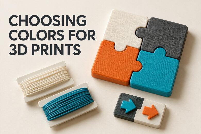
Before opening the slicer, write down what each color should communicate. A simple starting point is a base color for most of the object, a contrast color for text or symbols, and an optional accent for one important feature.
For example, a workshop bin could use a charcoal body, cream lettering, and a restrained teal marker for a particular tool category. If two colors serve the same purpose and look similar from a few steps away, you can usually remove one. This keeps the design calm and makes color assignment easier to check.
For ideas that put color to work, see our eight practical multicolor projects.
2. Check light and dark contrast first
A dark letter on a light background or a light symbol on a dark background is usually easier to identify than two colors with similar brightness. This matters most for small labels, arrows, room signs, dials, and objects seen in uneven light.
A quick test is to photograph your candidate filaments together and view the photo in grayscale. If the important symbol nearly merges into its background, choose a lighter or darker filament. Then inspect the real print at its intended viewing distance: screen color and printed plastic do not always look alike.

For categories and instructions, do not rely on color alone. Add a word, icon, number, or distinct shape so people can identify the object even if they perceive colors differently.
3. Plan for opaque, pale, and translucent filaments
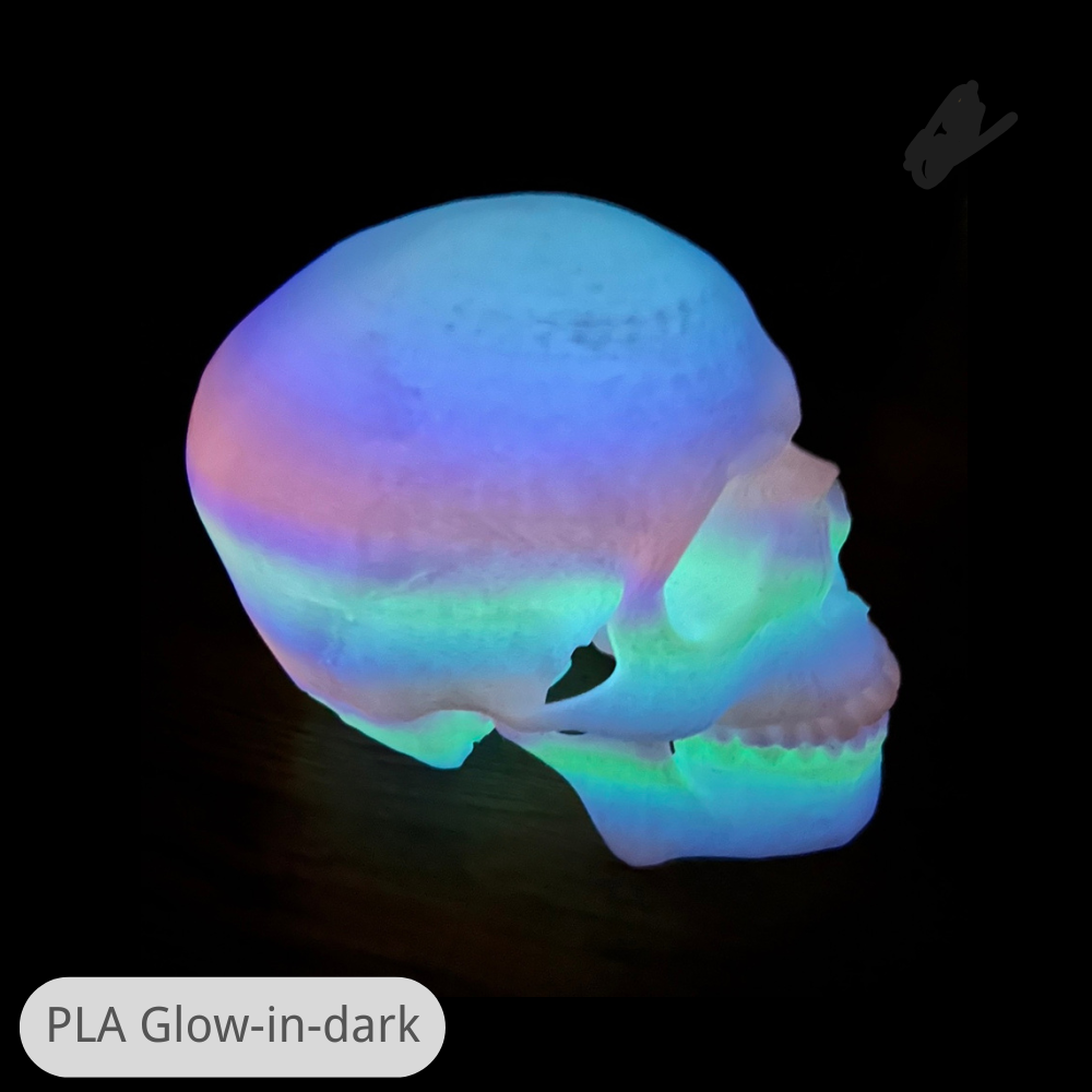
Filament color is affected by how much light passes through the printed surface. A thin light-colored wall may show dark infill, an underlying color, or light from behind. A translucent filament can be useful for a lamp diffuser, but it will not look like an opaque cream or white on the same model.
Print a small swatch at the actual wall or top-surface thickness you plan to use, with the real backing color beneath it. Check the combination in daylight and in the room where the object will be used. If the underlying color shows through, adjust the design or surface thickness and test again rather than trusting a screen preview.
On systems with a shared nozzle, switching from a dark filament to a pale one may also require more purging to keep the pale area clean. The amount depends on the actual materials and machine; use a small test before changing purge settings for a full model.
4. Treat surface finish as part of the palette
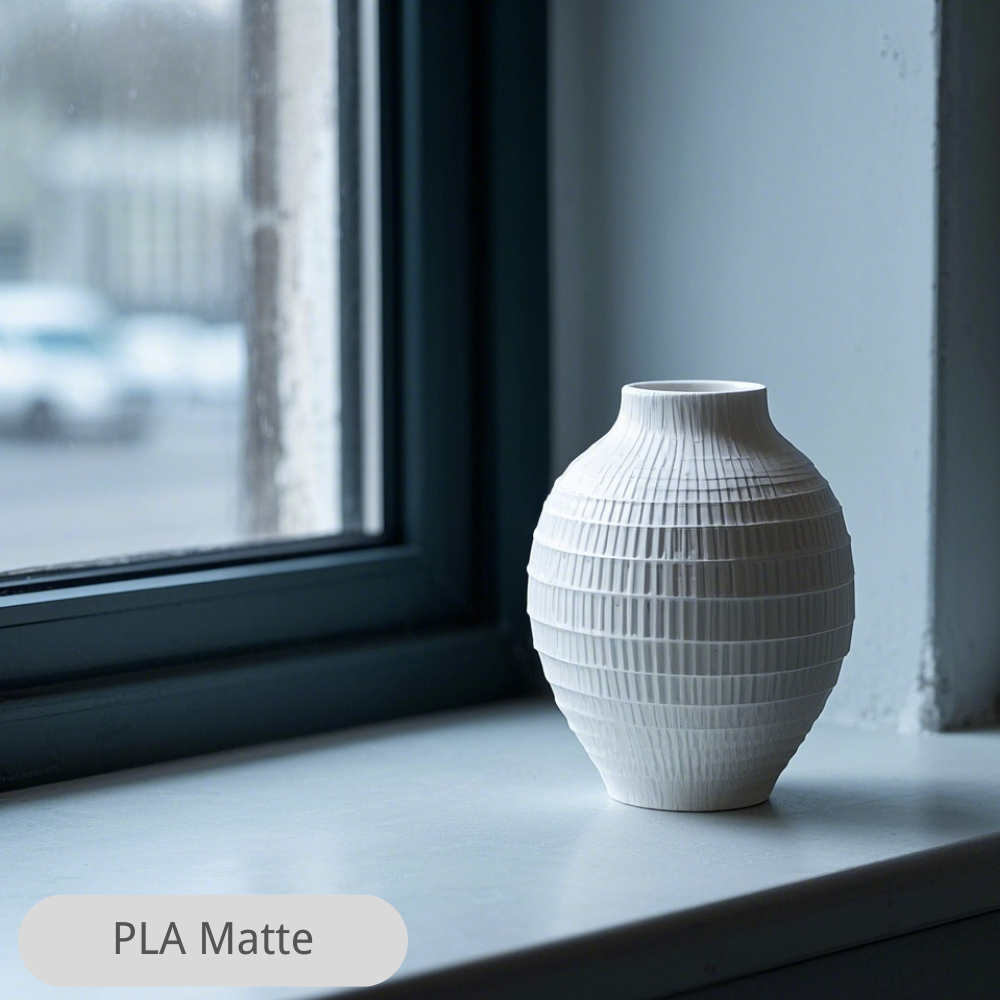
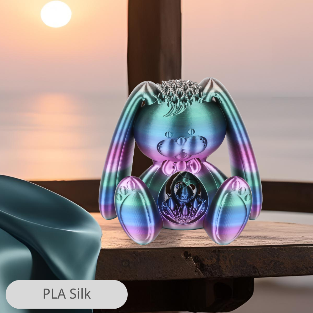
Matte, silk, glossy, textured, and translucent filaments can make the same pigment feel different. A glossy highlight draws attention, while a matte surface may make a broad color region feel quieter. Under strong directional light, gloss can also create reflections across small lettering.
Choose colors and finishes together. If readability matters, test the finished label under the lighting it will actually receive. If the goal is a decorative display, a deliberate difference in finish can be useful, but avoid assuming every color or finish will print identically: brands and formulations can call for different settings.

5. Make important color areas large enough
Fine lines and tiny dots can look attractive in a CAD view but vanish in the slicer. Every colored feature must be wide enough for a printable path with your nozzle and line-width settings. Some model details may be omitted or reshaped when sliced.
Use broad color blocks for the main idea, then reserve small accents for areas that genuinely need them. For letters, choose a font with sturdy strokes and enough space inside each character. For a logo or illustration, inspect the smallest island of color after slicing.

If a detail is too small, enlarge it, simplify the shape, or use a separate insert. Do not assume that adding another color will restore a feature that the nozzle cannot produce.
6. Look at the object where it will live
A desk organizer is usually seen from above. A door sign is seen from several steps away. A tabletop piece may be viewed under warm indoor light. Choose color placement for that real viewing angle, rather than only for the most flattering render.
Hold physical filament samples together, or print a small set of tiles. Compare them in daylight and under the room's normal lighting. A warm white may look yellow next to cool gray; a dark teal and charcoal may blend together in the evening. You can adjust the palette before committing to a large print.
7. Count color switches, not just spools
A model using three colors once in separate height bands can be a very different printing job from a model that alternates the same colors hundreds of times. Check the sliced preview for where colors change, how often they change, and whether the machine requires priming, wiping, or purge structures.
Keep a decorative color only if it earns its extra switching time and material. Sometimes a separate snap-in insert or a simple layer-based color change is the better design. For a close look at dark-to-light contamination, see our guide to preventing color bleeding.
Three palettes to test on a small sample
- High-contrast utility: graphite base, warm white text, teal accent. Try it on labels or workshop storage.
- Soft display: cream base, muted terracotta detail, charcoal outline. Try it on a nameplate or decorative tile.
- Bright focal point: neutral base, one saturated feature color, a pale highlight. Try it on a game token or teaching model.
These are starting points, not rules. Swap in the filaments you actually own, and check whether the contrast survives at the size and light level of the final object.
A quick color test before a long print
- Choose two or three filaments. Give each one a clear role in the object.
- Print a small sample. Include a raised symbol, a thin wall, and a few touching color areas at the intended layer height.
- Use the final material settings. If brands or material types differ, confirm their temperatures and shared bed requirements first.
- Inspect the sliced paths. Confirm the smallest letter or accent is actually printed and assigned to the intended tool.
- View the sample in place. Check it from the usual distance and under normal lighting.
- Check the boundaries and backing. Look for dark bleed into light areas, show-through, stray ooze, or unexpectedly glossy patches.
- Change one decision at a time. Adjust contrast, area size, or finish, then repeat only the relevant sample.
This small test often answers more than a large digital render. Keep the successful swatches with their filament names so future projects can reuse a proven palette.
Where the Sovol M1D fits
The Sovol M1D is currently listed for pre-order. Its DualX™ architecture combines one fixed toolhead with six automatically changed toolheads, supporting up to seven colors or materials in a job. Separate toolheads keep their own melt paths, which can reduce the dark-to-light flushing associated with a shared-nozzle system.
That does not mean a print always needs seven colors or produces absolutely no waste. Two or three carefully chosen colors may do the most useful work, and some jobs still need priming, wiping, or test material. Even with independently heated toolheads, different materials must still suit the same bed, surrounding environment, and contact surfaces. Check the current product page for configuration and availability details.
Common mistakes
- Judging colors only on a monitor: print physical swatches at the intended thickness.
- Using two similar-brightness colors for small text: strengthen the light-dark contrast and test viewing distance.
- Assigning meaning only by color: add a word, icon, number, or shape.
- Making colored details narrower than printable paths: inspect the sliced result and simplify as needed.
- Ignoring finish and opacity: shiny reflections and show-through can change the appearance.
- Loading every available color: count actual switching and use colors that serve the design.
Frequently asked questions
How many colors should I start with?
Two is enough for many signs, labels, and functional parts: one background and one clear contrast. Add a third when it helps identify a separate feature.
Why does my white print look gray over dark infill?
Some pale filaments and thin surfaces are not fully opaque. Print a swatch with the planned backing and surface thickness, then adjust the design if the dark area shows through.
Does a higher color count make a print better?
No. More colors can help a complex teaching model or illustration, but a simple object may be easier to read with fewer. Choose colors by their role and check the finished scale.
Can I apply web color-contrast numbers to a 3D printed sign?
Digital contrast guidelines are helpful reminders to make information distinguishable, but a printed object also has texture, gloss, thickness, distance, and changing light. Test the physical sign where it will be used.
Can I combine any two materials if their colors look right?
No. Materials must also print under compatible bed and environmental conditions, and their contact areas must behave as the design requires. Start with a tested material combination.
Conclusion
A good multicolor palette begins with purpose: a readable label, a clear category, or a feature worth highlighting. Choose the light-dark contrast first, then check finish, opacity, and the size of each color region on the real object.
Print a small sample under the final settings before committing to a long job. When the colors remain clear at normal viewing distance and the slicer produces reliable paths, the finished print is far more likely to look as useful as it did in the design.
