
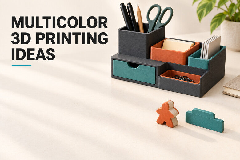
A multicolor print earns its colors when they help someone use, understand, or enjoy the object. A teal insert can show where spare nozzles belong; a pale word on a dark label can be read at a glance; different game pieces can identify players without paint.
Here are eight approachable projects to try. Most start with two or three colors. You can add more once the design and sliced preview justify them.
When does printing in color make a real difference?
Choose a project where color improves one of three things: recognition (finding the right item), readability (seeing text or symbols), or storytelling (making a model easier to understand). Large, deliberate color areas are usually easier to see and design than tiny dots of color scattered across every layer.
You can also print parts separately and assemble them. That works especially well for replaceable labels and inserts. When colors need to meet on one continuous face, a multicolor setup makes the finished result more convenient.
1. A color-coded desk or workshop organizer
Give different trays, pockets, or drawer fronts distinct colors so small parts have a home. For example, use a neutral body, teal for printer tools, and warm orange for fasteners. Make the color visible from the direction you normally approach the organizer, not only from directly above.
Start with a small modular tray. Check that the pockets fit the actual tools, and leave enough wall thickness for the chosen nozzle and slicer profile. Snap-in colored dividers are a useful alternative if you expect to change the layout later.

2. Drawer labels and tool tags you can read quickly
A contrasting letter or symbol is often more useful than a fully colored object. Try dark labels with light, raised text for filament drawers, storage bins, cable ends, or interchangeable tool cases. A simple icon can help when several labels are viewed from a distance.
Keep letters large enough to survive your nozzle and layer settings. In the slicer preview, check that every stroke produces a complete path. A small two-color label is a sensible first multicolor test because it prints quickly and shows whether boundaries are clean.
For shared spaces, do not rely on color alone: combine it with text or a distinctive shape so the label stays useful to people who perceive colors differently.
3. Tabletop game tokens and player pieces
Print sets of counters, pawns, or objective markers in player colors. A contrasting emblem on the top makes the piece easier to identify when several colors look similar under warm lighting. You can create a family of pieces with the same base geometry and swap only the symbol.
For pieces handled often, avoid very thin flags or delicate raised details. Test whether tokens can be picked up comfortably and stored together. If you use a board game with children, consider the age group and small-part safety before making loose pieces.

4. A terrain model that explains a place
A small relief map can use color to separate water, low ground, higher land, and a route. The same idea works for a classroom watershed, a hiking souvenir, or a presentation about a building site. A color key beside the model helps viewers understand the meaning rather than guessing it.
Use a suitable map or model source and check its scale. Make thin rivers and paths wide enough to appear in the sliced preview. Keep the base and text readable; too many small regions can obscure the terrain. Treat a decorative relief as an illustration unless its elevation data and scale have been verified.

5. A personalized nameplate or gift sign
A nameplate is a good way to make a gift feel specific to its recipient. Use one color for the background, one for the name, and a small accent for an icon or border. A door sign, desk plaque, or pet-name plate can all use the same basic design.
Choose a font with strong strokes and open spaces inside letters. Check spelling before slicing and view the object at its real size on screen. For a wall or door, plan the mounting method early: a beautiful face is less useful if screw holes or adhesive space were forgotten.
6. A visual assembly or demonstration model
Different colors can show which parts move, which side faces forward, or which pieces belong together. Think of a classroom gear demonstration, a camera mount mock-up, or a sample of a product with replaceable components. Use colors consistently across the model and its instructions.
Color is a visual cue, not a substitute for fit or strength testing. Print a small joint first, check clearances with your chosen material, and keep moving surfaces free of accidental fused color details. If components must be replaced, printing them separately may make servicing easier.
7. Garden markers with readable plant names
Plant markers benefit from high contrast because they are read from an angle and often in uneven light. A light name on a darker face, plus a simple herb or vegetable icon, can make a row of pots easier to identify. Make the stake broad enough to stand securely without an easily broken thin tip.
Choose a filament suited to the intended outdoor exposure, and check the particular manufacturer's guidance for weather and UV resistance. A pretty multicolor marker is still a test piece outdoors: monitor fading, warping, and legibility over time.
8. Decorative art tiles with a limited palette
A small geometric tile, coaster-like display piece, or wall motif lets you explore color without intricate modeling. Use two or three broad color blocks and one neutral background. Repeating the same motif with varied palettes can make a coherent set for a shelf or studio wall.
Keep adjacent shapes wide enough for reliable toolpaths and inspect the top-surface preview. If the object will touch heat, moisture, food, or heavy wear, choose materials and finishes for that use; a decorative print is not automatically suitable for every surface or application.
A simple workflow for your first multicolor project
- Pick one purpose for each color. Start with a base, a readable contrast, and perhaps one accent.
- Make important details printable. Zoom to actual size and check thin lettering, islands, and narrow color bands.
- Assign colors in the slicer. Separate model parts or paint regions, then verify the tool or filament assignment for each area.
- Inspect the sliced preview. Review missing paths, switch count, support needs, and any purge or priming structures required by your setup.
- Print a small sample first. A cropped corner or small label can reveal boundary and adhesion problems before a long print.
Color changes can add time, even when the machine handles them automatically. Compare the complete sliced job, not just the number of colors loaded. Put the most important colors where they are easy to see.
Where the Sovol M1D fits
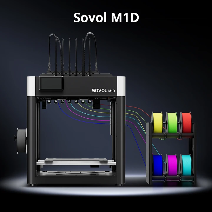
The Sovol M1D is listed for pre-order with a DualX™ layout: one fixed toolhead plus six automatically changed toolheads, supporting up to seven colors or materials in a job. The separate toolheads can be heated independently. That architecture is useful when a project changes colors repeatedly or when you want to keep different filaments in separate melt paths.
Its near-zero purge-waste approach aims to reduce the material normally flushed through a shared nozzle; it does not mean every job produces absolutely no priming, wiping, skirt, or test material. You do not have to use seven colors to benefit from the system. A clear two-color label or a three-color organizer is already a worthwhile project.
Before choosing materials, confirm that their shared bed, environment, and bonding requirements suit the design. Review the current M1D product page for configuration and availability details.
Frequently asked questions
Do I need seven colors for these projects?
No. Most ideas here begin with two or three. Add a color only when it improves recognition, readability, or the visual story.
Can I make these with a single-color printer?
Yes. Print separate colored inserts, letters, or components and assemble them. Painting is another option. A multicolor system is especially helpful when you want several colors integrated into one print.
Does multicolor printing make a part stronger?
Color alone does not increase strength. Material, model geometry, print orientation, layer bonding, and the way the part is used matter more. Test functional parts for their actual loads.
Will a toolchanger produce zero waste?
Separate melt paths greatly reduce the need to purge a previous color from a shared nozzle. Some jobs may still need priming, wiping, a skirt, or failed-test material.
Do I need a special model file?
Not always. Some slicers let you paint color regions on an existing model; separate model parts can also be assigned to different tools. Preview the actual sliced paths, because tiny painted details may not fit the chosen nozzle.
Conclusion
The best multicolor project uses color with intent. Organizers and labels become easier to use; game pieces become easier to recognize; maps and demonstration models become easier to explain. Begin with a compact two-color sample, check the sliced preview, and expand the palette only when the extra color does useful work.
