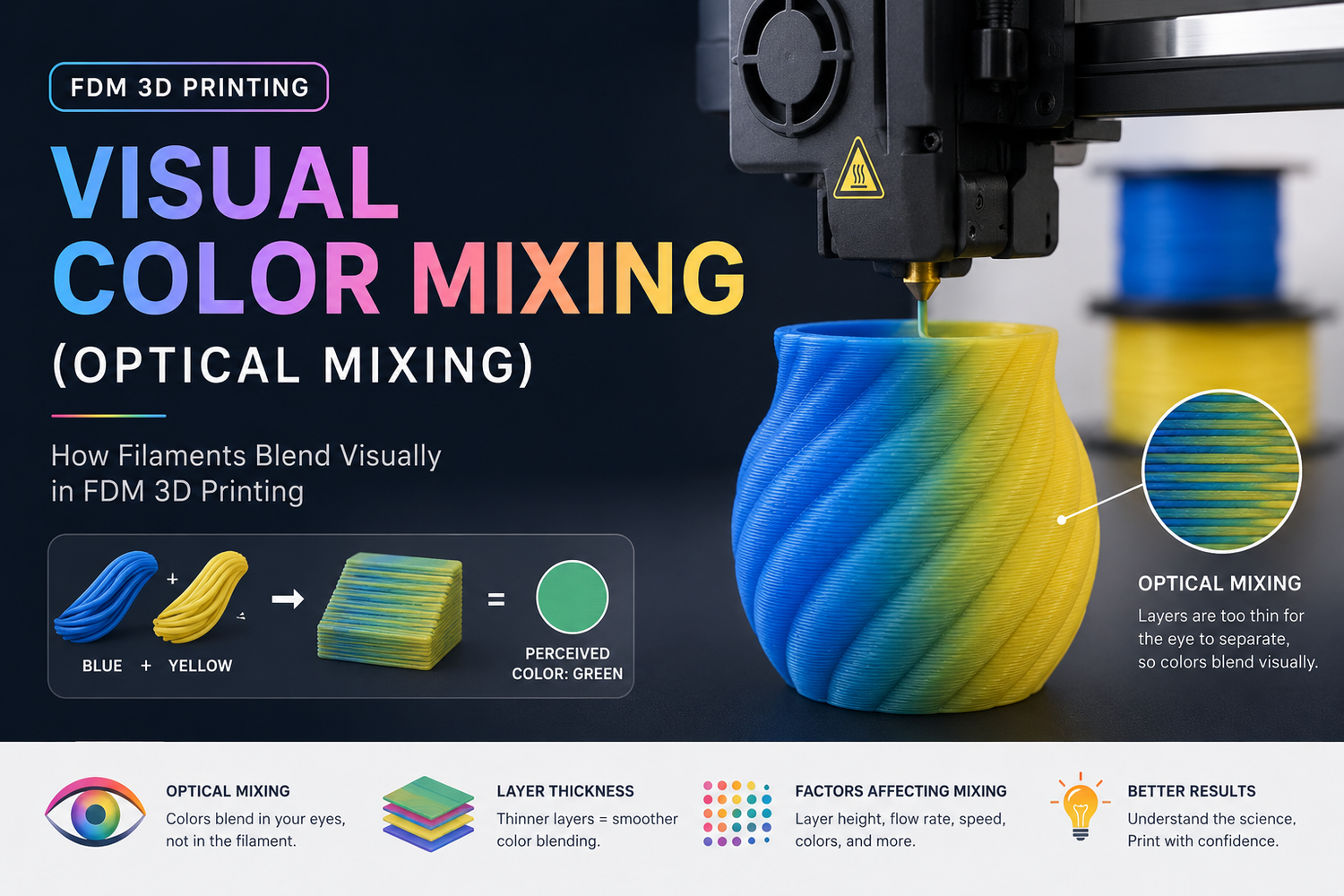
If you’ve seen an FDM print that looks like it contains a smooth gradient or an “in-between” color—even though the printer only had a handful of filaments—what you’re looking at is usually visual color mixing.
It’s not magic and it’s not a secret pigment blend. It’s a trick borrowed from 2D printing: place small bits of different colors close together, and your eyes average them into a new perceived color.
What “visual color mixing” means
Visual color mixing (also called optical color mixing) is when your slicer creates the appearance of a new color by printing tiny, repeating areas of two (or more) filament colors so close together that the pattern blends at normal viewing distance.
In the 3D-printing world, you’ll also hear the same idea described as dithering or halftoning (those terms come from how newspapers and printers fake smooth shades with dots).
Key Takeaway: Visual color mixing creates an illusion of a third color by patterning separate filaments. The plastic isn’t physically mixed into one uniform new color.
Key takeaways
- Visual/optical mixing is “color by pattern,” not color by chemistry.
- The two common approaches are dithering/halftoning (tiny XY dots/patches) and layer alternation (switching colors in Z).
- It looks best on sidewalls, at a normal viewing distance, with fine layer heights and a pattern scale your printer can actually resolve.
- Expect trade-offs: print time, purge waste (on single-nozzle systems), and visible texture up close.
Why makers use it
Because it unlocks effects that are hard to get with normal multi-color printing:
- Gradients and shading without needing a true mixing hotend
- More “virtual colors” than filaments loaded, by varying the ratio/pattern
- Poster-like shading on textured surfaces where perfect smoothness isn’t the goal
It’s also a useful middle ground for multicolor FDM printing with an AMS/MMU/toolchanger: more nuance than hard color boundaries, without jumping to industrial full-color processes.
How visual color mixing works in FDM
There are two main mechanisms. Most workflows use one, or a combination.
Dithering/halftoning: mixing in the XY plane
This is the most direct form of “optical mixing.” The slicer converts a target shade (or an image) into a field of tiny colored cells—dots, pixels, or short line segments—made from your available filament colors.
From 30 cm away you may see speckles. From 1–2 meters away the surface can read as a smoother, blended tone.
When it works best
- On surfaces where the pattern can be small and consistent (often vertical walls)
- When your printer can place the pattern finer than your eye can resolve at the expected viewing distance
Common failure mode
- Your dots/patches are simply too large, so the part looks “salt-and-pepper” instead of blended.
Layer alternation: mixing in the Z direction
Instead of mixing side-by-side, you alternate colors layer-by-layer (or every few layers). Your eyes integrate the stack of colored layers into a perceived intermediate tone.
This is easier to understand if you imagine a striped sandwich: from far away it looks like one color; up close you see the stripes.
When it works best
- With smaller layer heights (thick layers create obvious banding)
- On sidewalls where the Z striping is what you actually see
Common failure mode
- Banding: the “mix” turns into visible stripes.
“Virtual colors” and CMYK-style approaches
Some modern workflows talk about virtual colors: you pick a target color, and the slicer approximates it using ratios/patterns of a smaller base palette (often inspired by CMYK printing).
The important mental model is still the same: it’s optical averaging, not real pigment blending.
A good overview of this trend is All3DP’s report on virtual colors via optical mixing in a slicer workflow. Treat “virtually unlimited colors” as a direction of travel, not a promise—your printer’s resolution and your filament choices still set hard limits.
Visual mixing vs true mixing: don’t confuse the two
People often lump these together, but they’re different in what’s happening inside the nozzle.
|
Method |
What’s happening |
What you get |
What to watch out for |
|---|---|---|---|
|
Visual/optical mixing (dithering, layer alternation) |
Colors stay separate; your eye blends them |
“Virtual” intermediate shades at distance |
Speckle/stripe visibility; surface dependency |
|
True filament mixing hotend |
Filaments physically blend in the melt zone |
More uniform intermediate colors |
Calibration complexity; transition contamination |
|
Multi-color with toolchanger/AMS/MMU |
Colors are separate by tool or swap |
Clean boundaries; can be very reliable |
Time + purge waste depending on workflow |
If you’re still deciding which hardware approach fits your kind of projects, Sovol’s dual-extruder vs AMS guide helps frame the practical differences. (If you’re mainly worried about time and purge waste, the Sovol post on multi-color printing costs is a good next read.)
The tuning knobs that actually change results
If you want this to look good, focus on the variables that control pattern visibility and color contamination.
1) Layer height
If your “mix” looks like stripes, the first fix is usually smaller layer height.
Layer alternation especially depends on it: thinner layers mean thinner stripes.
2) Line width and nozzle diameter
A larger nozzle and wide lines make patterns more visible. That doesn’t mean optical mixing is impossible with a 0.6 mm nozzle—but you usually need:
- bigger parts
- longer viewing distance
- less ambitious “photo-like” goals
3) Pattern scale (cell size)
This is the core of optical mixing:
- too large → obvious dots/speckles
- too small → muddiness, unstable detail, or the slicer can’t place it cleanly
If your workflow lets you choose a dither type or cell size, start conservative and print a small swatch first.
4) Color ratio (how much of each filament)
Even with the same two filaments, different ratios can read like different “virtual” shades.
A practical approach: build a tiny “color chart” tile and test a few ratios (for example 25/75, 50/50, 75/25). That’s faster than guessing on a full model.
5) Filament opacity and lighting
Translucent filaments often blend more smoothly because light can pass through and scatter across layers.
Opaque filaments can still work, but they tend to show patterns more clearly—especially under harsh directional LEDs.
Pro Tip: Judge your test swatches under the same lighting and distance the part will actually be seen. A mix that looks fine in diffuse daylight can look speckled under a single bright desk lamp.
6) Transition cleanliness (single-nozzle swaps)
If your printer uses one nozzle with frequent filament changes, “visual mixing” can degrade into “muddy mixing” if transitions aren’t clean.
If you’re using AMS/MMU-style swapping, purge settings and path planning matter. This is also where print-time and waste can surprise you.
Where visual mixing works well—and where it disappoints
Here’s the honest version.
Works well
- Vertical sidewalls (your eye averages the pattern across the surface)
- Decorative textures (the texture hides the “pixel structure”)
- Larger parts viewed from farther away
- Controlled palettes (a small set of base colors you’ve tested)
Often disappoints
- Top surfaces: they don’t “stack” the same way visually, so the blend can fall apart.
- Close-up inspection: you will see dots, stripes, or a weave.
- Small parts: the pattern has nowhere to “shrink” into—your nozzle sets a physical limit.
- High-contrast targets: some colors are hard to approximate with your base filaments.
There’s also a deeper point: in multimaterial research, dithering is used specifically because it can approximate continuous appearance using discrete materials—while still having non-linear perception and resolution limits. If you want that conceptual background (not FDM-specific), this open-access paper on voxel/material dithering in multimaterial printing research is a useful reference.
⚠️ Warning: If you’re expecting Pantone-level accuracy or photo-real color matching, FDM optical mixing is usually the wrong tool. It can look great, but it’s not a calibrated color process.
A quick, low-waste way to try it
If you only do one thing, do this:
- Pick two filaments that are reasonably “mixable” (same material type is easiest).
- Print a small calibration tile (flat wall + a curved section if possible).
- Try 3–5 ratios or pattern settings.
- Evaluate from your real viewing distance.
- Only then commit to a full model.
Sovol’s guide to multi-color slicing techniques is a good companion read if you want the broader workflow options.
Next steps
If you want to go deeper, the next “upgrade” after understanding visual mixing is getting clearer about your multi-color workflow constraints (waste, time, reliability). Start with these: