
Two people can print the same desk organizer and end up with objects that feel completely different. One looks at home beside a laptop and a lamp; the other still looks like an early prototype. The difference is not always a more expensive printer or a smaller layer height.
A finished-looking 3D print usually has a clear visual idea: the color suits the object, the surface finish supports its shape, and details such as seams, edges and joints look intentional. Visible layer lines do not automatically make a print look unfinished. A loose lid, sharp support scar or distracting color combination often matters more.
Here is how to make 3D prints look better without turning every project into a sanding and painting job.
1. Decide what the object should look like before choosing filament
Start with its surroundings. A pen cup for a quiet home office, a fantasy dragon and a workshop tool holder do not need the same appearance. A metallic effect can make a decorative model more expressive, while a simple single color may suit an enclosure better.
Choose three words for the result you want: for example, “quiet, warm, simple” or “bright, playful, readable.” Use those words to judge your model, filament and finishing decisions. This is more useful than assuming every object needs to look like an injection-molded product.
- Desk accessories: coordinate with nearby objects rather than adding every available color.
- Display models: choose a finish that emphasizes the silhouette and sculpted details.
- Useful parts: prioritize fit, comfortable edges and clear labels.
2. Give each color a job
A restrained palette is an easy starting point. Choose one main color, then add a contrasting color only where it helps: a name, an icon, a removable section or a feature someone needs to find.
A dark organizer with light lettering can be easier to read than one with several similarly bright colors. Equally, a colorful toy may look exactly right in a room where a neutral accessory would feel out of place. The aim is coherence, not a universal rule that fewer colors are always better.
For everyday monochrome projects, explore Sovol PLA filament. Check the actual product and variant before planning a palette; a collection does not guarantee every color or finish is available.

Try looking at a small color sample beside the object’s intended surroundings. Website photos, screen brightness and room lighting can change how a color appears. A thumbnail of a whole model is also a useful check: if its main shape becomes hard to recognize, the palette may be competing with the design.
3. Match the surface finish to the shape
Color and finish are separate choices. Two white filaments can produce very different-looking surfaces if one is matte and the other is glossy.
| Finish | Where it can work well | What to watch |
|---|---|---|
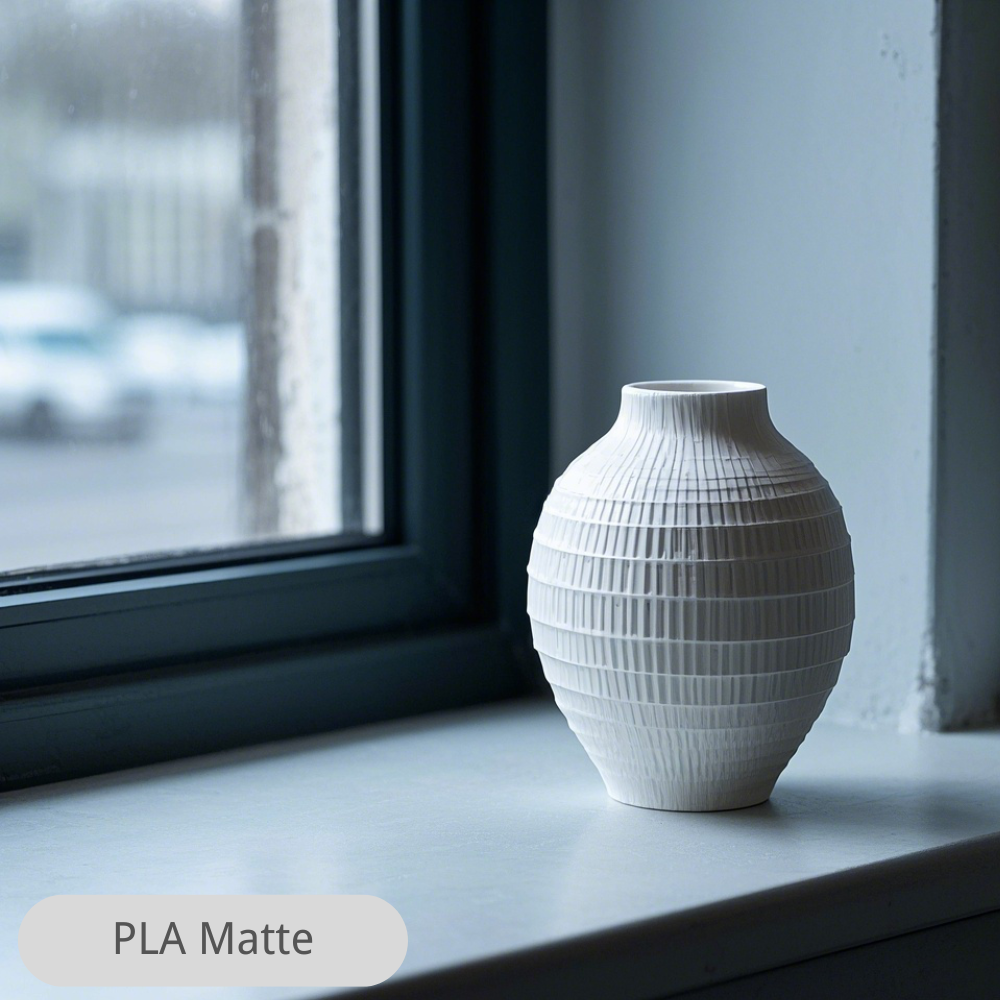
| Matte or satin | Understated accessories and broad visible surfaces | Can soften the appearance of small imperfections, but does not remove them |
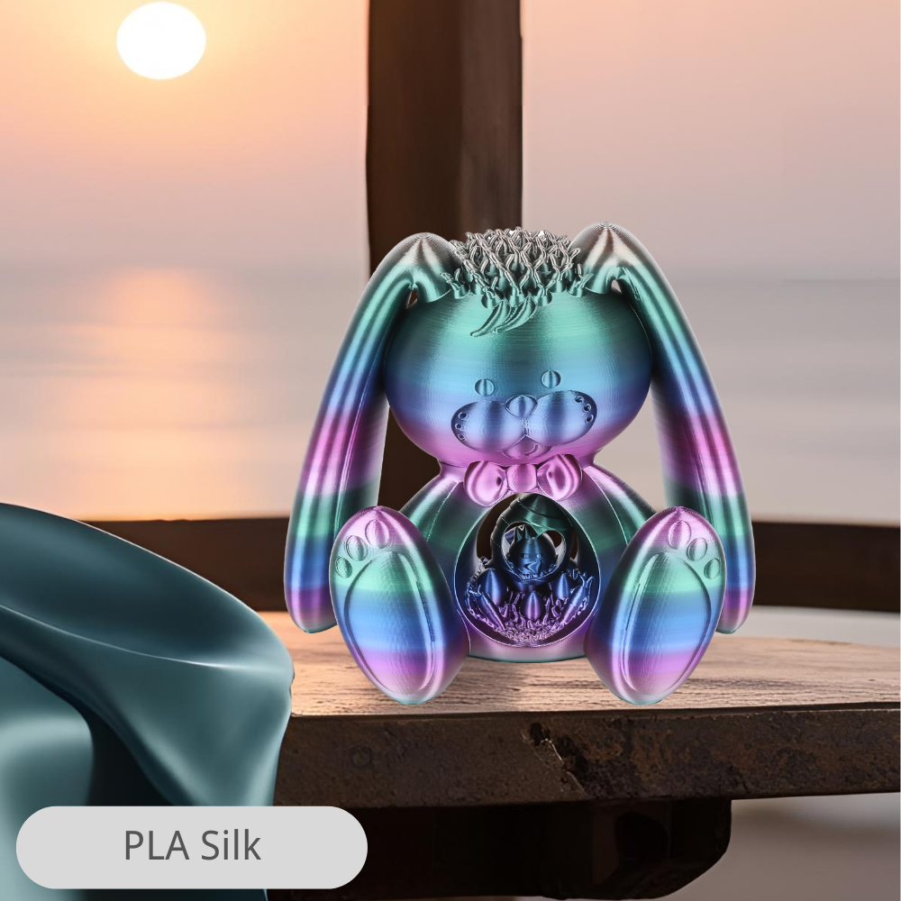
| Silk or glossy | Sculptures, curves and decorative accents | Reflections can reveal seams and uneven surfaces |
| Co-extruded multicolor | Objects intended to change appearance with viewing angle | Not the same as placing separate colors on specific features |
| Gradient | Decorative shapes suited to a gradual color transition | The visible transition depends on filament consumption and the spool |
If a reflective decorative finish suits your project, see Sovol Silk PLA. For an angle-dependent effect, Sovol Silk Tri-Color PLA in Rose, Blue and Yellow uses co-extruded colors. Neither effect requires the printer to assign each color to a separate region, and neither replaces controlled multicolor printing for crisp logos or labels.

Do not select a material purely because it looks attractive. A decorative silk finish is not a strength rating, and a glossy surface does not establish heat resistance. Check the specific filament’s requirements and suitability for the object’s use.
4. Let geometry do some of the work
A broad flat wall can expose every small surface change. Repeated ribs, facets or a deliberate texture can give the same object a clearer visual rhythm. These features work best when they belong to the design, rather than being added everywhere to disguise poor printing.
For an enclosure, rounded corners and consistent wall proportions can make a larger difference than an elaborate surface pattern. For a pen holder, a clean rim and a stable, properly finished base can be the details you notice every day.
When choosing a downloadable model, inspect the maker’s photos and other users’ makes. Look at the underside and assembly details, not only the most flattering cover image. A render is a design preview, not evidence of a successful print.
5. Put seams and support marks where they matter least
Before slicing, decide which surfaces will actually be visible. Position the Z seam toward a less prominent side where the model and slicer allow it. Compare orientations to reduce support contact on the main display face, then check the toolpath preview.
There is a trade-off: an orientation that improves appearance can increase support use, reduce stability or create an unfavorable layer direction for loads. For a functional part, strength and fit still come first.
Use a reliable material profile and inspect a small test section before committing to a long print. A finer layer height may improve curved or sloping surfaces, but it will not repair loose joints, missing extrusion or a poorly positioned support interface.
6. Make assembly feel deliberate
A two-part object looks unfinished when the gap changes around its edge or the lid rocks when touched. A consistent gap can look intentional, even when it remains visible.
- Test a small mating section before printing a complete enclosure.
- Remove support residue from contact surfaces.
- Check screw recesses and fastener alignment.
- Place glue joints on less visible surfaces where practical.
- Check that the object sits flat and does not catch fingers or cables.
Choose the material for those requirements as well as its appearance. Sovol PETG filament is another option to evaluate for everyday functional projects. Verify the specific formulation, expected temperature and loading conditions rather than treating “PETG” as a guarantee that a part is suitable.

7. Finish the details people actually touch
Remove stray strings, trim a rough brim edge and clean support contact points carefully. Often, these small tasks improve an everyday object more than sanding every visible surface.
If you do want paint, allow for surface preparation and drying time. Test the sanding and coating process on a spare piece first, and follow the coating manufacturer’s instructions. Sanding alone changes surface texture; it does not automatically create a uniform factory finish.
Also look at the object in its real setting. Harsh close-up lighting exaggerates texture, while soft lighting can hide faults. Judge it both at normal viewing distance and in your hand. Photographs should represent the result honestly.
A real model to try: one design, two visual directions
Choose a simple desk accessory so you can compare appearance without spending days printing. Two starting points are Modern Pencil Cup by MSBstudios and the modular vase-mode pen holder by DrJones.
These are independent creators’ model pages, not Sovol designs or models tested for this article. Check the current files, license, dimensions and creator instructions. Vase-mode designs require a compatible slicing workflow.
- Choose one model and one size.
- Print a small sample in your preferred everyday color.
- Compare a second finish or color while using the appropriate profile for each material.
- Inspect the rim, base, seam and appearance beside your desk accessories.
- Choose the version that best fits its intended use, not simply the one that photographs most dramatically.
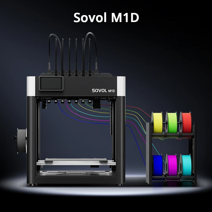
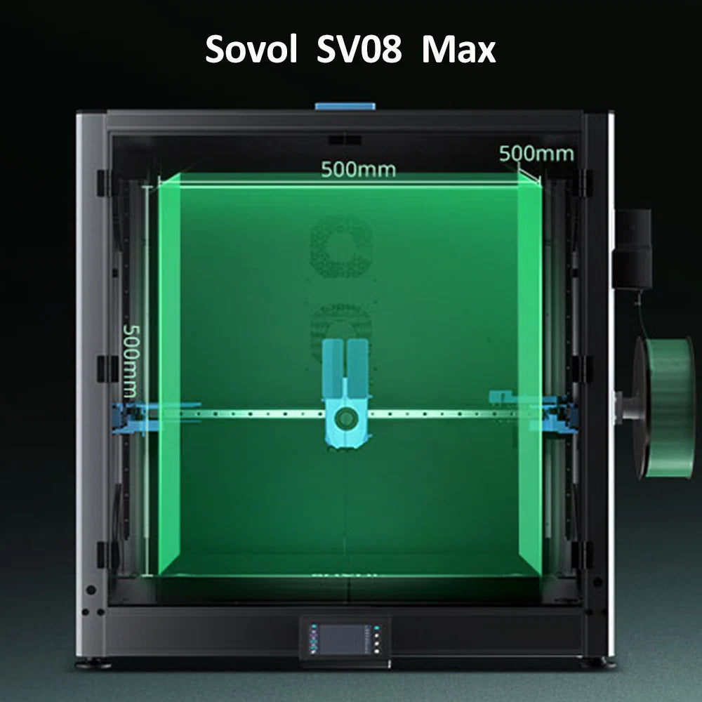
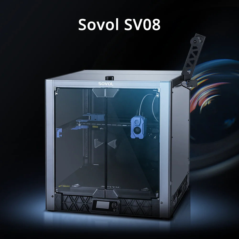
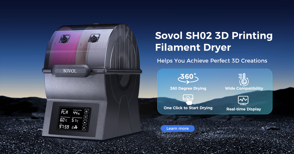
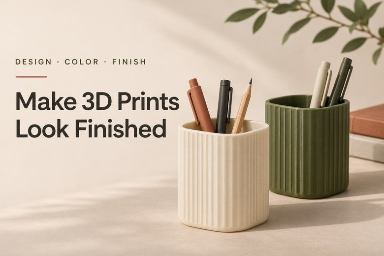
The cover is a conceptual illustration, not a photograph of either linked model or a material comparison test. Product images show official Sovol examples; they do not promise an identical result on every printer.
Frequently asked questions
Do I need a multicolor printer to make professional-looking prints?
No. A single-color object can look complete through good proportions, a suitable finish and clean details. Controlled multicolor printing is helpful when labels, logos or separate color regions are part of the design.
Does matte filament always look better than silk?
No. Matte can suit understated objects, while silk can emphasize sculptural curves. Choose according to the design and its surroundings, then test the specific filament.
Will a smaller layer height hide all print lines?
No. It can reduce geometric stepping, especially on curves, but seams, extrusion consistency, material finish and lighting remain visible influences.
Should I paint every print?
Only when the project benefits from it. A well-chosen filament can provide the appearance you want without a coating. Paint adds preparation and can affect dimensions at mating surfaces.
A finished look comes from consistent choices
Start with the object’s purpose, then coordinate its color, finish and visible details. A simple model with a thoughtful palette, clean edges and a well-fitting lid can feel more complete than a complicated print with unresolved details.
Find the Right Filament for Your Next Print
Explore everyday PLA, reflective Silk PLA and PETG options. Choose a finish that suits the design, then check the product specifications and available variants.
